Upgrading Dye & Pry Workflow
IPC-TM-650 Summary: Upgrading Your Dye & Pry Workflow
For semiconductor Failure Analysis (FA) engineers, IPC-TM-650 is the definitive gold standard. Specifically, when we look at the methodologies surrounding Dye and Pry testing, this standard dictates exactly how we evaluate the mechanical integrity of Ball Grid Array (BGA) solder joints.
But while the standard itself is incredibly precise, the way the industry reports on it has been stuck in the past.
Let's break down the core requirements of IPC-TM-650 for BGA evaluation and look at why moving away from manual spreadsheets is critical for modern failure analysis.
The Core of the Standard
At its heart, dye and pry testing under IPC-TM-650 requires us to forcibly separate a component from its printed circuit board (PCB) after it has been submerged in a penetrant dye. By examining the fractured solder balls under a microscope, we can identify exactly where and how a joint failed.
The standard requires us to categorize these failures into specific fracture modes, typically including:
- Pad Crater (PCB side): The fracture occurs in the laminate material beneath the PCB pad.
- Interfacial Fracture (PCB side): The break happens between the PCB pad and the bulk solder.
- Bulk Solder Fracture: The crack propagates directly through the middle of the solder ball.
- Interfacial Fracture (Component side): The break is between the component package and the bulk solder.
Accurately identifying the failure mode is only step one. Step two is mapping it.
The Excel Bottleneck
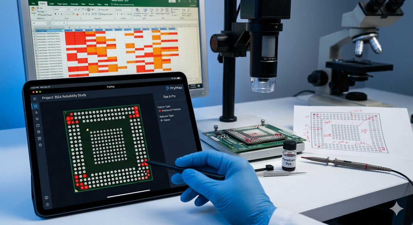
For years, the standard workflow for mapping these failures has been painfully manual. An FA engineer sits at a microscope, evaluates a solder ball, and then manually changes the background color of a cell in a massive Excel grid to represent the failure mode.
For a small 4x4 matrix, this is annoying. For a modern, high-density, or staggered BGA package with hundreds or thousands of pins, it is a massive liability.
Relying on spreadsheets leads to:
- High Error Rates: Accidentally coloring the wrong cell when your eyes are constantly shifting between a microscope and a monitor.
- Geometric Limitations: Excel is built for perfect grids. It fundamentally struggles to accurately represent staggered matrices or packages with missing pins.
- Wasted Engineering Hours: Highly paid engineers spend hours doing manual data entry instead of analyzing the actual failure mechanisms.
Generating Accurate Failure Distribution Maps
To truly comply with the spirit of IPC-TM-650—which demands precision and accuracy—our reporting tools need to match our testing tools.
Instead of hacking spreadsheet software to do something it was never designed for, modern FA teams are moving toward purpose-built software. By generating mathematically precise failure distribution maps, engineers can visualize the exact layout of any standard JEDEC package with zero geometric distortion.
A true failure distribution map allows you to instantly spot failure clusters, edge effects, and corner stress concentrations without the visual noise of a spreadsheet.
The Bottom Line
IPC-TM-650 gives us the framework to confidently analyze board-level reliability. However, executing that standard effectively requires abandoning legacy manual processes. By transitioning to automated failure distribution mapping, FA labs can cut reporting time by hours, eliminate transcription errors, and deliver clearer, more actionable data to their clients.